How to make a web comic part 4: Inking Run Freak Run

No Comments on How to make a web comic part 4: Inking Run Freak Run

This is a follow up article for “How to make a web comic”-series Part 3: Drawing Run Freak Run

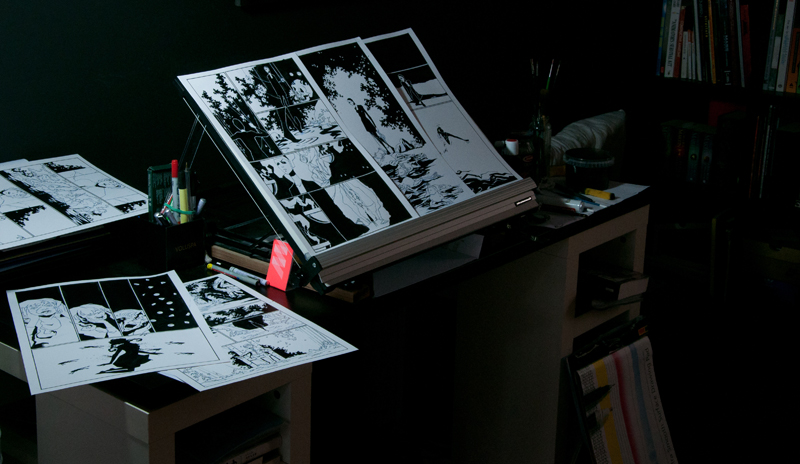
Inking is definitely the most relaxing part of the process. Most of my big decisions are already made in the thumbnailing and drawing stages and I can just focus on the final art.

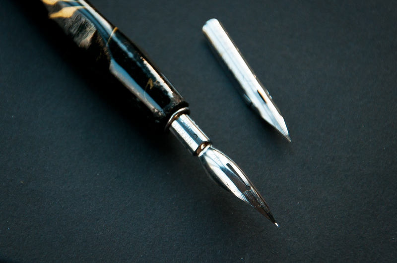
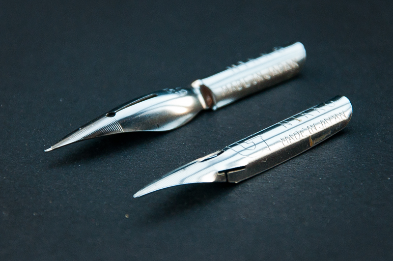
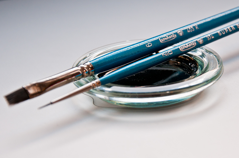
First I ink all the lines with a nib pen and after that I fill in the black areas with different sized brushes. The nibs I use are either “G-pen” nibs or “saji-pen” nibs. They produce lines of very similar thicknesses. However, you’ll notice that there are significant differences in the way make lines. G-pens are a little more flexible than saji-pens, and therefore offer a bigger range in line variation. Saji-pens can achieve thick and thin lines too, but because the nib is a little firmer the effect will be a bit softer. Also, saji-pen’s tip has a soft curve, which I think adds to the softer, more flowy line.

Saji- and g-pen nibs are just two out of many types you can use. As you get used to working with nib pens, you’ll start noticing which nibs fit you best and give you the line quality you want. It’s very individual, and even though the differences between different nibs are subtle, they will feel huge once you start working with them properly. So don’t settle on the first nib you get your hands on!

When you get your nibs out of the package for the first time, either burn the tip for a couple of seconds with a lighter or run them under hot water and then wipe them with a paper towel. The nibs are coated in oil which prevents them from rusting while they’re in the package, but it will also prevent the ink from flowing consistently when you start using it.

As to paper preference, the A3 Bristol paper (extra smooth surface) has become my number one favourite. The smooth surface is perfect for nib pen work. In my experience the sharp nibs tend to pull on fibres of softer, more textured papers and get clogged constantly. Another “limitation” of a textured paper is that the softer the paper, the more the ink will bleed around the lines you’re making. All of this can be a great advantage if you use brushes instead of nibs. Here too, I recommend experimenting with different combinations until you find one that you can fall in love with.

In my final steps I scan the page and open it in photoshop. The final clean up consists of getting rid of the blue pencil lines by selecting the page, going to “channels”, selecting the blue channel (which will get rid of the blue lines), copying the page, switching back to RGB and pasting the copied page in layers. Then I go to “levels” and make the black areas fully black and whites fully white.

This is where my job ends. In the next step Silver takes the pages and brings them to life with lettering. But telling about it is his domain :)

Cheers,
-Kaija

How to make a web comic part 3: Drawing Run Freak Run

No Comments on How to make a web comic part 3: Drawing Run Freak Run


This is a follow up for the previous article in the “How to make a web comic”-series: Thumbnailing Run Freak Run

This part will be more of a step by step compared to the “Thumbnailing Run Freak Run”-article. All the compositional and storytelling rules still apply, but since we already did a quick overview of some of the important topics, I’ll jump straight to the practical stuff:

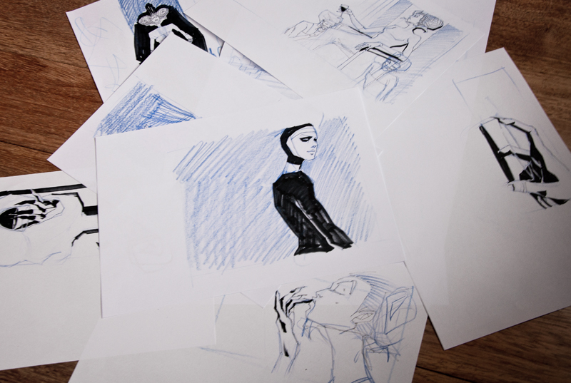
When the thumbnails are scanned, I print out each page in A4 and A3 formats. I clip the A4s together to form a book that I can flip through and “read”. The blown up thumbnails look like a big mess to anyone apart from me and Silver (whom I keep constantly in the loop and to whom I’ve extensively explain each jumble of shapes I’ve made). The A3s serve as a shortcut to not having to sketch each page in big format. I use a lightbox for the following sketching and re-sketching.

This is also the part of the process when I take out the iPhone and take loads of references for the panels. In the end I use a relatively small part of the photos taken, but I like to experiment with different gestures and angles through photos. Using photo references is a smart thing to do, especially if you’re working with even remotely realistic proportions. References are a great way to build your mental library and research things that you had no previous knowledge of. And if the goal of your image is to impart a sense of reality, why guess when you can find out :) When you are looking at a photo you should not be copying it down to every detail, but using it for what it is, a reference. What will make it unique and yours is how you interpret the information in front of you.

I tend to leave small, time consuming details (like small vegetation, textures and patterns) out of this stage and figure them out while inking. When I’m happy with the results, I draw the panels on a A3 bristol paper with a blue pencil.

Check out the next article in the “How to make a web comic”-series part 4: Inking Run Freak Run

-Kaija

How to make a web comic part 2: Thumbnailing Run Freak Run

2 Comments on How to make a web comic part 2: Thumbnailing Run Freak Run

This is a follow up for the first article in the “How to make a web comic”-series: Writing Run Freak Run

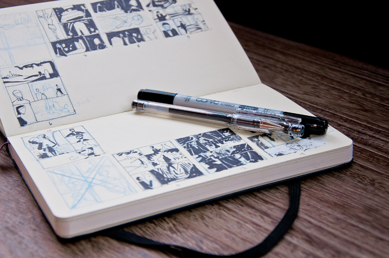
For me thumbnailing is the most important step in order to deliver consistent storytelling. In addition to delivering high quality art, our end goal is to make sure that each panel has a purpose within the story and moves the reader forward. If we create a comic by only making beautiful, stand alone images, then they will end up stopping the reader and pulling them out of the narration. It would be the equivalent of constantly pausing a movie and watching a single shot. The shot can be beautiful, but you wouldn’t have much of a storytelling experience.

I sit down with the script, break it down to pages and then draw the whole storyline in one go. The small size of the thumbnails helps to concentrate on the big picture and not to get stuck on small details or the quality of the pictures.

It’s always important to remember the composition of the whole page. Strong composition can set the mood of a sequence before you even start reading and guide the reader’s eye through the page. Setting your panels in a certain way and using different sizes and shapes should result in a sense of rhythm to the narration.

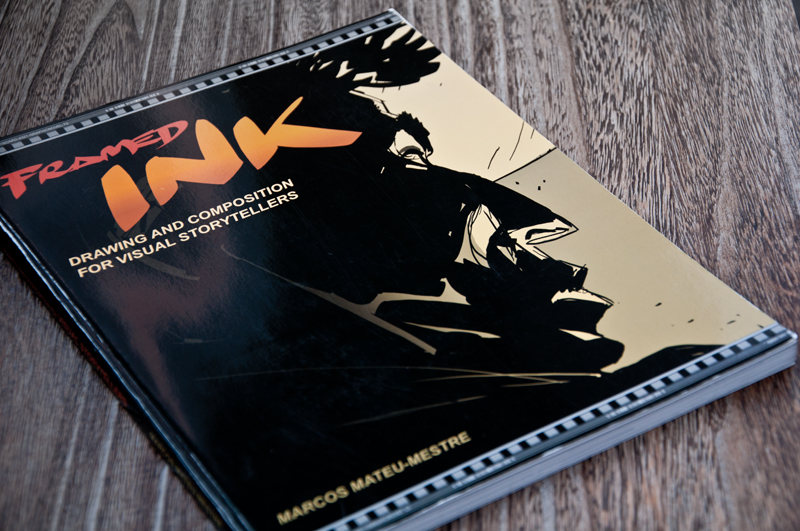
A great book that explains composition of visual storytelling is “Framed Ink: Drawing and Composition for Visual Storytellers” by Marcos Mateu-Mestre. It deals with many compositional rules with clear examples that help illustrate the point. I highly recommend reading it :)

Check out the next article in the “How to make a web comic”-series: Drawing Run Freak Run

Toodle-oo!
-Kaija

How to make a web comic part 1: Writing Run Freak Run

No Comments on How to make a web comic part 1: Writing Run Freak Run

This post will go through the steps of writing a Run Freak Run comic page; it will cover how we start, how we work together and how I make the script as useful as possible for Kaija. In later blog posts Kaija or me will go through the others steps of our pipeline. This article is for all of you who are interested in how Run Freak Run is created and how it moves from prose to drawings.

Writing a page, the first step in our pipeline is also the fastest when compared to the labor intensive tasks like drawing and inking. And for the sake of this article, we’re assuming that you have all the world building and concepts at least somewhat figured out.

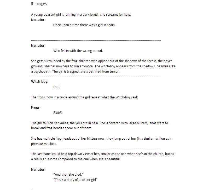
Everything I write, I start it with a loose bullet point outline. Let me give you an example for the first 5 pages in the first RFR chapter.

– Narrator say: Once upon a time in Spain, there was a girl
– Girls runs in dark forest.
– She’s scared.
– A monster follows her.
– She falls.
– The monster makes a spell.
– Frogs start coming out of the girls body, with exploding power.
– She dies.
– Narrator says: This a story about another girl.
– Next day, beautiful countryside, Inquisitor Two and Alonso are riding to town.

I like writing in bullet points; it’s easy, stress free and it lets me keep track of the big picture while also being great for fast progress. Every now and then I put a snippet of dialogue or description to the bullet points, just as an indication for a dialogue and what’s the main point for it. I’ve made the mistake of going to too detailed way too early, and got caught in trying to make sense of all the insignificant problems that shouldn’t matter yet. Now, I just cover as much ground as possible first and fix all my mistakes later. I only stop to ask myself what I’m promising with the story and how will I resolve them later.

Next step is to write my notes as prose. I’m still going fast and ignoring all grammar and format rules. I’ve noticed that being mindful of my writing kills my momentum. As long as it’s understandable, I go forward and start putting more thought and descriptions into the locations and dialogue, making sure that every character sounds different on paper. It doesn’t matter so much what they say, but how Kaija perceives their personality.

At this point, I’ll also attach reference pictures to help communicate my ideas for locations and characters. Kaija can use them as a starting point for creating her own reference library for the chapter.

When both me and Kaija feel confident about where the major plot and dialogue are going, I change the text into a format where it becomes easy to read for Kaija’s thumbnailing and drawing stages.

I won’t touch the script again until Kaija comes back with the her thumbnails. At that point we review the story and dialogue and see if it needs any major changes. As long as it makes sense, we go forward and I won’t touch the dialogue or story before lettering and editing phase.

Every creative team works differently and the process changes depending on how it is made. Most publishers and editors only deal with the writer, whose script they review, revise and approve, until it goes to the artist and letterer, never to be seen by the writer again. In these cases the writer usually breaks the comic, not only into pages, but also into panels and gives elaborate descriptions for the artist to work with. It’s a good and efficient workflow for an industry that has tight deadlines, but it doesn’t really allow happy mistakes. Of course there’s exceptions, but in general, most of the comic scripts I’ve seen have panel-by-panel breakdowns.

Since Run Freak Run a self-published webcomic, we can do whatever we want, in whatever order we want. And it seems that is how most webcomics work as well, without any formal guidelines, figuring themselves out as they onward.

For additional studying, you should get your hands on scripts from different authors, analyze them, learn the pipeline and break the magic behind them.

One of my favourite comic book writers, Brian Wood has some of his scripts online for you to study. The scripts he has online change depending of the publisher and artist he works with and I think they’re great learning material for anyone:
http://www.comicbookscriptarchive.com/archive/scripts/brian-wood-script-pack/

How to write a webcomic summary:
– Don’t stop for your errors, ride that momentum!
– Start by bullet point plot lining.
– Ask yourself what promises you make and how you resolve them.
– Then write it in prose, still ignoring your mistakes.
– Then format it into a script and fix grammar.
– Edit and revise at the appropriate time (lettering and editing)
– Study and find out what works for you. :)

Tune up for more steps on how we make the comic!

How to make a web comic: thumbnailing Run Freak Run

See you laters, alligators – Silver